- What is this, and what is it for?
- What do you need?
- Preparing the device (micro:bit)
- First live measurement, step by step
- The interface at a glance
- Chart types
- Time window, zoom, 3D rotation
- Customising data series (name, colour, visibility)
- Loading earlier data and comparing
- Table view
- Prediction (curve fitting)
- Saving (CSV, PNG)
- Troubleshooting
1. What is this, and what is it for?
bit:plot is a measurement system that runs in the browser for classroom experiments: it plots the sensor data of a device connected over USB (micro:bit, Arduino, Raspberry Pi Pico…) live, with thirteen chart types, and can also reload and compare earlier measurements. No installation and no server are needed: all data stays on your computer, nothing is uploaded to the internet.
The interface is available in three languages (Hungarian, English, German) — switch it with the drop-down at the top right.
2. What do you need?
- For live measurement: Chrome or Edge (because of the Web Serial technology) — on a desktop or laptop.
- For analysing earlier data: any modern browser, even on a tablet (not for measuring, but yes for analysing).
- A sensor device with a USB cable (for live measurement), or a previously saved CSV file.
3. Preparing the device (micro:bit)
The device must write its data to the serial port at 115200 baud. The program understands two formats:
- Named:
temperature:23.5— one or morename:valuepairs per line, separated by commas (e.g.x:120,y:-40,z:980). - Raw number: just a single number per line (e.g.
35) — the program takes it as “value” automatically (with several numbers: “value 1”, “value 2”…).
MakeCode example (built from blocks)
A single named value (name:value) — e.g. temperature with the
“serial write value” block:
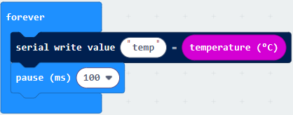
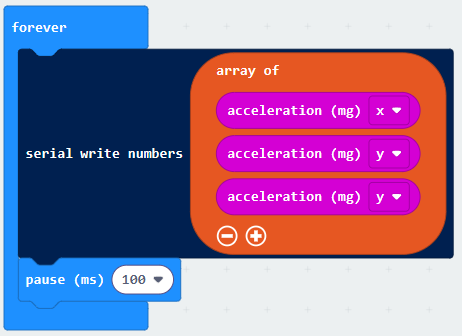
temp:23.5).Several raw numbers at once (e.g. the X-Y-Z axes of the accelerometer) — with the “serial write numbers” block, as an array:
MicroPython example
from microbit import *

while True:
    print("temperature:{}".format(temperature()))
sleep(200)name:value format.
4. First live measurement, step by step
- Connect the device to the computer with a USB cable.
- Click the Connect button (top right) and pick the device from the pop-up list (e.g. “mbed Serial Port” or “USB Serial Device”).
- Click Start measurement — the data is drawn live.
- When finished: Stop measurement. The data stays in the view, ready to be saved or analysed.
5. The interface at a glance
Header (top row)
| Element | What it does |
|---|---|
| Connect / Disconnect | Opens/closes the serial connection. |
| Start / Stop measurement | Controls recording (appears after connecting). |
| Data… | Loading earlier measurements (from file or clipboard) and deleting them. |
| Table | The measured numbers in a movable table window. |
| Save CSV / Save PNG | Downloads the data or the chart image. Active only when there is data. |
| Language selector | Magyar / English / Deutsch — switches everything instantly. |
| ▲ Controls and ⛶ | Collapse the control bar (giving the chart more room), or full screen — useful for projecting and on tablets. |
Control bar
- Data (top left, only with loaded data): which data source to focus — from a drop-down.
- Time window: 10 s / 30 s / 1 min / Full / Custom — how much of the time series is shown.
- Chart-type tiles (centre): the thirteen chart types — switchable in one click, the data is not lost.
- ‹ Back (below the tiles, only when there is somewhere to go): one level up from the focused data/panel.
- Axes: Separate panels / Shared / Two axes (for time-series types).
- Scale (for meter bars, 3D and radar): manual min–max bounds — empty means automatic.
- Statistic (for pie, meter bars, big number and radar): what the chart shows from the window’s data — Last / Sum / Average / Count.
- Cumulative (for time-series types): the running total of the channels from the start of the window — for event counting (sending 1 per event) this is the growing “total events over time” curve (e.g. total cars so far). It combines with Prediction: the fit then runs on the cumulative curve — cumulative cases + logistic estimates the final total (plateau), event count + linear estimates the rate.
- Prediction (right): curve fitting on/off.
6. Chart types
| Type | What it is for |
|---|---|
| Line | Change of a continuous quantity over time — the default view. |
| Point + line | The same, with the measured points marked — instructive with few samples (you can see that a measurement is a series of discrete samples). |
| Area | The area under the line filled in — conveys accumulation. |
| Step | Data that changes in jumps, state-like (a counter, a switch). |
| Bar | Values as bars along the timeline. |
| Scatter (X–Y) | The relationship of two channels (not by time) — looking for correlations. X and Y from the bar’s selectors. |
| 3D motion | The trajectory of three channels (e.g. the accelerometer’s X-Y-Z axes) in space — rotatable with the mouse, zoomable with the wheel. |
| Histogram | The distribution of the values — what is common, what is rare. |
| Box plot | Statistical summary: min, quartiles, median, max, mean — with exact numbers. |
| Pie | The proportion of the channels in
slices. With the Statistic switch you can choose whether it shows
the proportion of the last values, the sums, the averages or the sample
counts — for event counting (e.g. traffic counting: the device sends 1 per
event as a:1 / b:1) “Sum” gives the real
comparison of the amounts. |
| Big number | One channel’s value as a huge number — instrument mode, for projecting. With the Statistic switch it can also show sum/average/count (e.g. “47 cars so far”). |
| Meter bars | Value(s) as “thermometers”, with a manually adjustable scale — one bar per sensor. Here too the Statistic switch offers last / sum / average / count (for event counting the bars show the amounts). |
| Radar | The “profile” of several channels on
one set of axes arranged in a circle (one spoke per channel). The
Statistic switch sets what each spoke shows — last / sum /
average / count — and the shared radial scale can be fixed with the
Scale fields. It is most useful for comparing
several loaded datasets (with “All” selected in the
“Data” picker): each source is drawn as its own polygon over the same
web, so a single glance shows how the measurements differ. The spokes are
the union of the sources’ channels; where a source has no data for a
channel, its polygon is pulled to the centre. Sonar mode: the Sonar switch replaces the profile with a live polar distance–angle display (like a rotating radar/sonar). Pick the two channels with the Dist and Angle selectors; the latest (distance, angle) point sweeps around, 0° (up) is the first measured angle, and rotation is clockwise. The range can be fixed with the upper Scale field (e.g. 400), otherwise it is automatic. Typical device: an ultrasonic distance sensor on a rotating servo sending distance,angle pairs. |
7. Time window, zoom, 3D rotation
- Live windows (10 s / 30 s / 1 min): the view follows the fresh data. Full shows the entire measurement.
- Custom: a from–to range you type in (in seconds) — clicking the button opens the fields.
- Zoom in by dragging: on the time-series chart select a section with the mouse.
- Wheel: zooms in/out around the time under the cursor. Scrolling out expands to the whole measurement.
- In 3D view: drag = rotate, wheel = zoom. The
Scale fields fix a common range for the axes (e.g.
-1024 – 1024for the accelerometer) — so the cube does not “breathe” even during live measurement; if the data exceeds it, the view expands on its own and never cuts the trajectory.
8. Customising data series
Click a data series’ name in the legend (below the chart) — a pop-up lets you set:
- Name: renaming (channels of loaded data too!) — the axis labels and the header of the saved CSV use this as well;
- visible: turning the series on/off — affects every chart type (an unwanted channel can be hidden);
- colour, line style (solid/dashed/dotted), point (size and shape: circle, triangle, square, star…).
In Two axes mode the “Left / right axis…” button opens a panel where you can assign which channel goes to which side — for data of different magnitudes (e.g. temperature and light level together).
9. Loading earlier data and comparing
- Open the Data… panel.
- Load the measurement From file… (several files can be selected) or From clipboard… (e.g. CSV copied from the micro:bit data log).
- With one loaded dataset that dataset is shown right away, with the full toolset.
- With several the “All (comparison)” view starts: for time-series types on one shared chart, for the other types one small figure per source.
- Focusing: click a small figure, or pick from the “Data” drop-down — the full toolset (prediction too) switches to that dataset. The ‹ Back button returns to the comparison.
- Live measurement alongside loaded data: if you connect and measure, the “Current” measurement is drawn next to the loaded ones in real time — so the fresh experiment can be compared with the earlier one.
- Deleting: from the panel’s “Delete” drop-down you can choose to drop one specific dataset or all of them.
10. Table view
The Table button shows the raw numbers (time + channels) in a movable, resizable window. Clicking a row highlights the matching point on the chart with a time marker. The number of rows can be limited (20 / 100 / 500 / All).
11. Prediction (curve fitting)
In a time-series view, the program fits a model to a chosen channel and forecasts up to twice the measurement’s span — “what do we expect next?”. Three models are available:
- Linear — steady change (y = a·t + b);
- Exponential — cooling/decay, tending to a limit;
- Logistic — saturating growth (S-curve).
The fitted equation and R² (goodness of fit) appear below the chart. On the first activation, downloading the numerical packages (numpy/scipy) may take a minute or two — the measurement keeps running undisturbed meanwhile.
Together with the Cumulative switch, the prediction fits the running-total curve — this is the classic forecasting combination: event counting + linear gives the rate and the expected final total at a given time; the saturating case count (cumulative) + logistic estimates the plateau (total number of cases), as with epidemic curves.
12. Saving (CSV, PNG)
- Save CSV: you can choose to save the whole measurement or only the visible view. The header contains the channel names and units you set. The saved CSV can later be reloaded in the “Data…” panel — this is the recommended archiving format.
- Save PNG: an image of the current chart (with the legend), e.g. for a lab report or a presentation.
13. Troubleshooting
| Symptom | Solution |
|---|---|
| The device does not appear at Connect. | Check the cable (there are “charge-only” cables that carry no data!). Try another USB port. On the micro:bit, update the firmware if it is very old. |
| “Could not open the port — maybe another program is using it.” | Close the serial console of the MakeCode/Mu editor or the other browser tab that is connected to the device, then try again. |
| “The device was lost — the USB connection dropped.” | Contact fault: moving broke the USB link. Check the connector; for moving measurements use a radio bridge (chapter 3). |
| Data arrives but nothing is drawn. | Check the format: it must be name:value or a raw number
per line, at 115200 baud. The Table view shows what the program
recognised. |
| No button for live measurement / “Web Serial: not supported”. | Live measurement needs Chrome or Edge. Loading and analysing still works in other browsers. |
| The interface behaves oddly after an update. | Force reload: Ctrl+F5 (the browser may keep the old version in its cache). |