Developing Ajax-Based User Interfaces
with JSF: An Introduction to ADF Faces Rich Client Components
Purpose
In this tutorial, you learn how to create
JSF pages using Oracle ADF Faces Rich Client (RC). Oracle
ADF Faces Rich Client is a set of standard JSF components that include built-in
Ajax functionality. While Ajax allows rich client-like applications to run on
standard internet technologies, JSF provides server-side control, which reduces
the dependency on an abundance of JavaScript often found in typical Ajax applications.
Place
the cursor over this icon to load and view all the screenshots for this tutorial.
(Caution: This action loads all screenshots simultaneously, so response time
may be slow depending on your Internet connection.)
Note: Alternatively, you can place the cursor over
an individual icon in the following steps to load and view only the screenshot
associated with that step. You can hide an individual screenshot by clicking
it.
Overview
This tutorial shows how to create ADF
Rich Client JSF pages and exposes some easy to implement facilities such as
Drag and Drop, Pop up and images.
Starting from an existing application,
you create a page template and use it to build your page.
The page holds the content of a shopping
cart on one side and displays the available products on the other side. An other
pane displays the product details. You implement a drag and drop functionality
enabling you to fill your shopping cart by moving a selected product in the
shopping cart area. You also create Tabs and Accordions and add a pop up window.
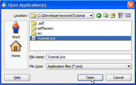
Have access to or have installed Oracle JDeveloper
11g Version 11.1.1.2.0. You can download it from Oracle
Technology Network.
2.
Download the startup application.
Right click the following link and choose
Save Link As.. from context to download the Tutorial.zip
file on a local directory of your choice.
3.
Unzip the Tutorial.zip file on
a local directory of your choice.
4.
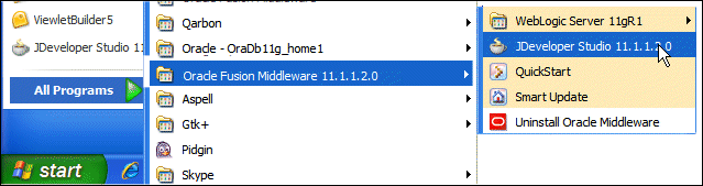
Start JDeveloper by selecting Start >
All Programs > Oracle Fusion Middleware 11.1.1.2.0 > JDeveloper
Studio 11.1.1.2.0
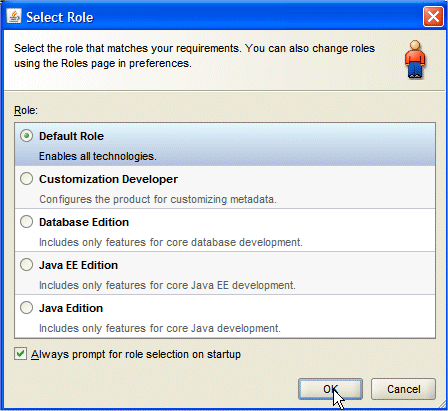
If the Migrate User Settings dialog box opens, click
NO.
In this section, you are going to create
a page template that will be used for the pages of your application. To create
the page template perform the following steps:
1.
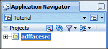
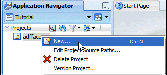
In the Application Navigator, right click the adffacesrc
project and select New from context.
2.
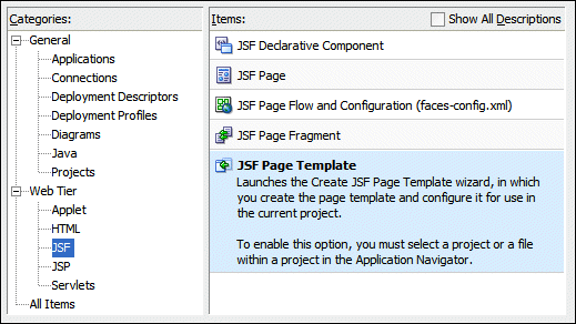
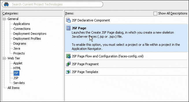
In the New Gallery, in the Categories pane, select Web Tier
| JSF, then select the JSF Page Template item.
Click OK.
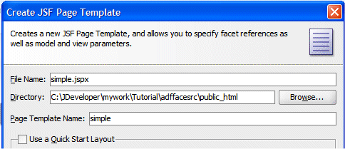
3.
In the Create JSF Page Template, type simple for
the Page Template Name.
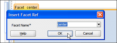
In the Facet Definitions tab, click the Add
button and type
center as the Name.
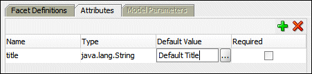
Click the Attributes tab, click the Add
button , then
type title as the Name and Default Title
as the Default value.
Click OK.
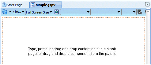
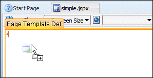
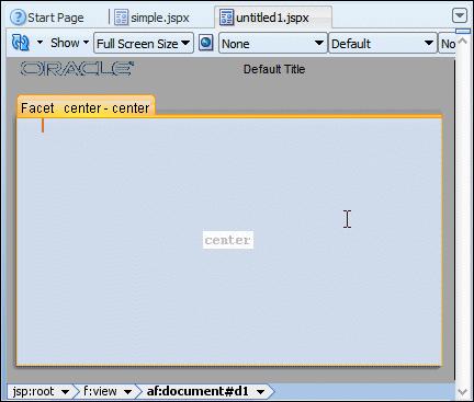
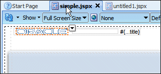
4.
The simple.jspx template page opens up in the design
editor.
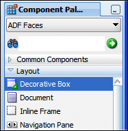
5.
From the Component Palette, using the ADF Faces | Layout
library, drop a Decorative Box onto the empty
page.
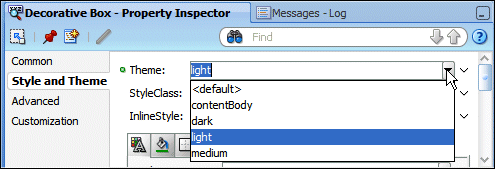
Using the Property Inspector, in the Style and Theme
tab, set the Theme property to light
from the list.
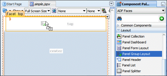
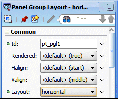
6.
Drag and drop a Panel Group Layout onto the top
facet.
In the property inspector, set the Layout property to horizontal.
7.
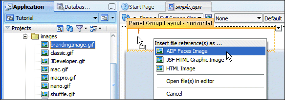
In the Application Navigator, expand the Web Content | images
nodes and drag and drop the brandingImage.gif node
onto the Panel Group Layout. In the context menu select
ADF Faces Image.
8.
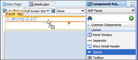
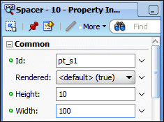
From the ADF Faces | Layout, drop a Spacer
next to the image.
Set the Width property to 100.
9.
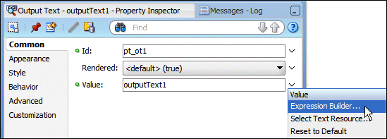
From the ADF Faces | Common Components, drop an
Output Text under the spacer component.
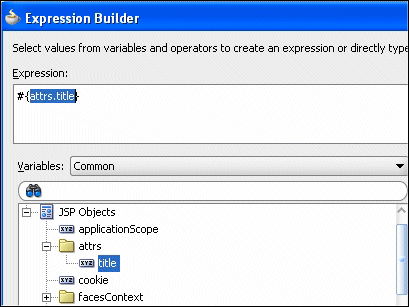
In the Value field, choose Expression Builder from
the drop down list.
In the Expression Builder, clear out the existing expression and select
JSP Objects | attrs | title.
Click OK.
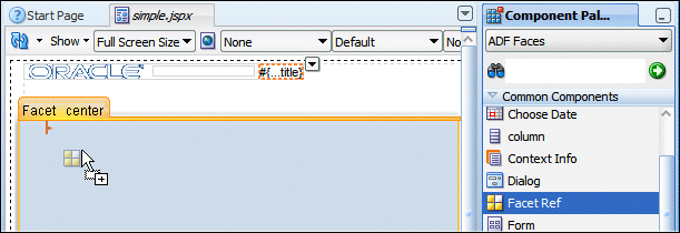
10.
From the Component Palette, drag and drop a Facet Ref onto
the center facet.
In the Insert Facet Ref dialog, select center as the
facet name.
Click OK.
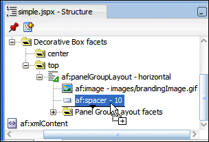
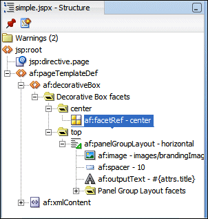
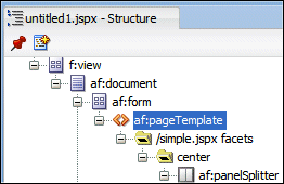
11.
The structure and the design of the template page should now look
like this:
12.
Click Save All
icon on the JDeveloper menu bar, or select File | Save All from
the menu to save the diagram.
To create the basic layout for the page, perform the following
steps:
1.
Right click the adffaces project and select New
from context.
2.
In the New Gallery, in the categories pane, select Web Tier
| JSF. Select JSF Page as the item.
Click OK.
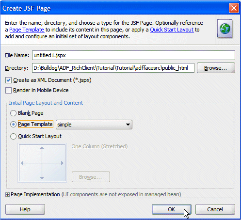
3.
In the Create JSF Page dialog, leave the file name to the untitled1.jspx
default value and ensure the Create as XML Document (*.jspx)
check box is selected. Select simple from the drop-down
list for the Use Page Template field.
Click OK.
4.
The untitled1.jspx appears as a new node in the Application
Navigator and it opens up in the Design editor using the simple.jspx template.
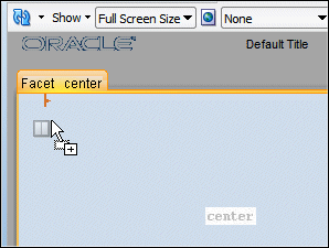
5.
From the component palette, using the ADF Faces | Layout
library, drag and drop a Panel Splitter component onto
the center facet.
6.
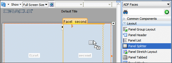
Drag and drop another Panel Splitter
component onto the 'second' facet of the panel splitter.
In the Structure pane, expand the panelSplitter component
and select the showDetailItem one. Using the property
inspector, set the Orientation to vertical.
7.
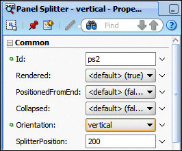
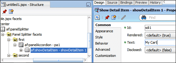
Drag and drop a Panel Accordion component onto the
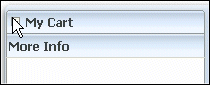
'first' facet on the left hand side of the panel splitter.
In the Structure pane, select the showDetailItem component
and using the property inspector, set the Text to My Cart.
8.
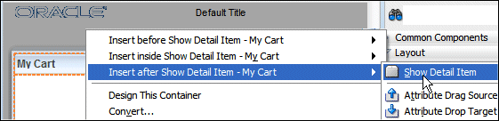
Click within the accordion you just created, then right-click and from
context select Insert afterShow Detail Item
--> Show Detail Item.
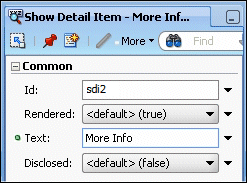
For the show detail item that you just added, using the Common tab of
the Property Inspector, change the Text field to More Info.
9.
Drag and drop a Panel Collection component onto the
right hand side 'first' facet.
10.
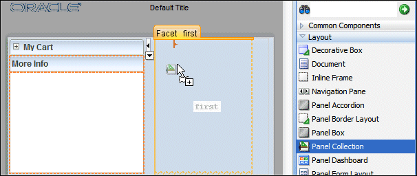
Drag and drop a Panel Tabbed component onto the right
hand side 'second' facet.
In the Structure pane, select the af:showDetailItem
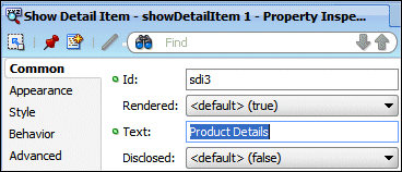
component you just created and In the Property Inspector, enter Product
Details in the Text field.
11.
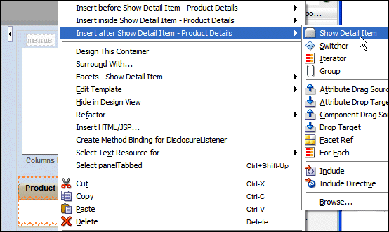
Right click the Product Details tab and select Insert
After Show Detail Item | Show Detail Item from context.
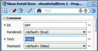
In the Structure pane, select the af:showDetailItem
component you just created and In the Property Inspector, enter Rating
in the Text field.
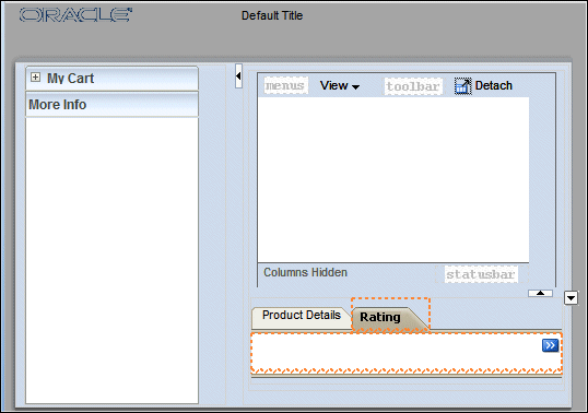
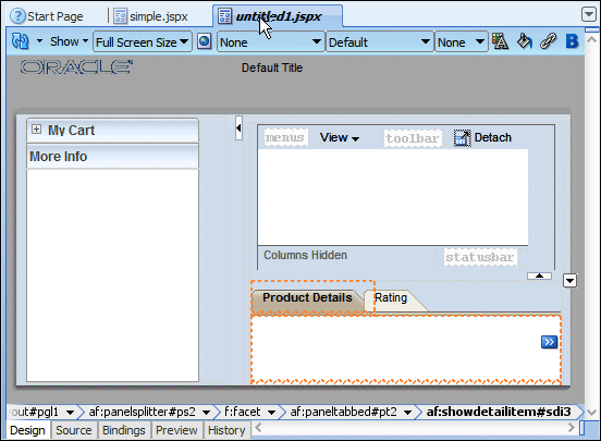
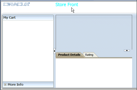
12.
The page should look like this:
13.
Click Save All
icon on the JDeveloper menu bar, or select File | Save All from
the menu to save the diagram.
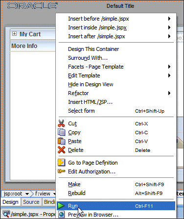
14.
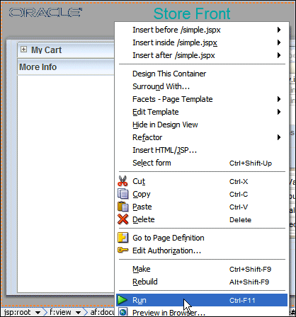
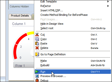
Right click within the page design editor and select Run
from context to load the page in your default browser.
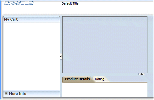
15.
The page loads up in your browser.
16.
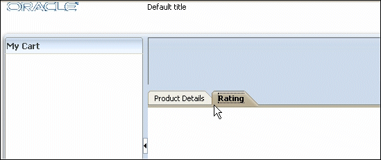
Try to move the Panel borders and experiment working
with the tabs.
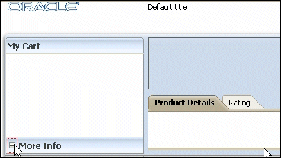
17.
Try the accordion by clicking the MoreInfo plus sign (located at the bottom of the page).
18.
Leave the browser window open and switch back to JDeveloper.
In the following steps, you customize the page title component
defined in the page template.
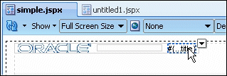
1.
Back in JDeveloper, click the simple.jspx
tab to open the page template in the design editor.
2.
In the page design, select the
title component.
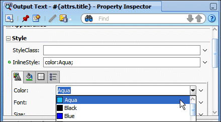
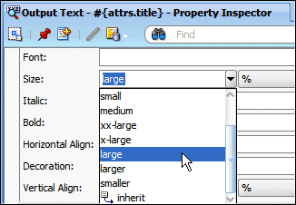
3.
In the Property Inspector, expand the Style
node, and using the Text tab, in the Color
field click the color drop down list and select the color of your choice
(Aqua in our example).
In the Size field, select large
from the drop down list.
4.
Click Save All
icon on the JDeveloper menu bar, or select File | Save All from
the menu.
5.
Switch back to your browser window where your application
is running and click the Reload/Refresh button.
Note that after saving your JDeveloper application,
refreshing your browser window reflects the new changes made to your
application as long as you haven't updated any binding component. In
that case you will need to reRun the page from JDeveloper in order to
have the changes reflected in your browser.
6.
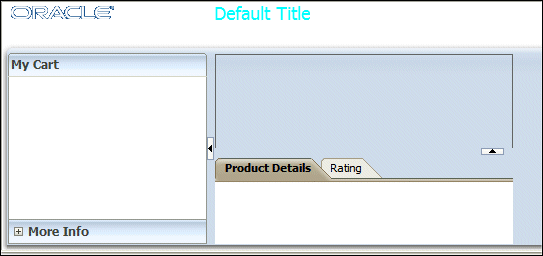
The page refreshes with the new generic title characteristics.
7.
Leave the browser window open and switch back to
JDeveloper.
8.
Open the untitled1 page in the
design editor.
9.
In the Structure pane, select the pageTemplate
tag and in the Property Inspector, set the title property
to Store Front.
10.
Click Save All
icon on the JDeveloper menu bar, or select File | Save All from
the menu.
11.
Switch back to your browser window where your application
is running and click the Reload/Refresh button.
12.
The page refreshes with the new title characteristics.
13.
Close the browser window open and
switch back to JDeveloper.
To create a data control and bind it to an ADF table component,
perform the following steps:
1.
From an existing POJO Class, we now create the data control
using the ADF Data Binding facility.
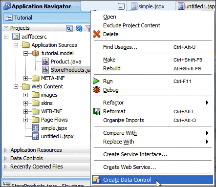
In the Application Navigator, expand the Application Sources node
and right-click StoreProducts.java in the Application
Sources | tutorial.model path and select Create Data
Control from context.
The Application Navigator should look like this:
2.
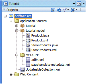
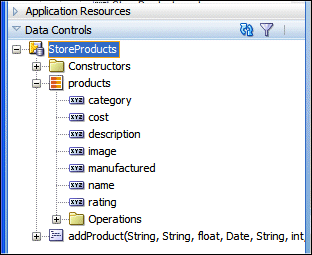
In the Application Navigator, open the Data Controls
accordion and expand the StoreProducts node. The Data
Controls pane should look like this:
3.
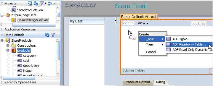
Drag and drop the StoreProducts | products data control
onto the af:panelCollection in the design editor of the
untitled1 page. From the pop up menu, select Tables --> ADF
Read-only Table...
4.
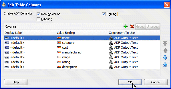
From the Edit Table Columns dialog, select Row Selection
and Sorting options.
Click OK.
5.
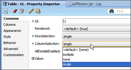
With the table selected in the Structure pane, on
the Behavior tab of the Property Inspector, set the Column
Selection property to single from the drop-down
list.
6.
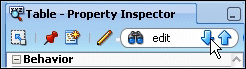
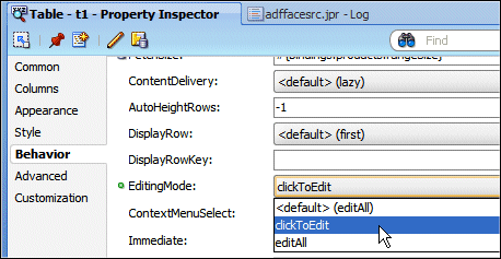
For the Table component, in the Property Inspector type edit
to look for a property containing this word.
If necessary, use the Down Arrow icon until you locate the EditingMode
property, then select clickToEdit from the drop down
list.
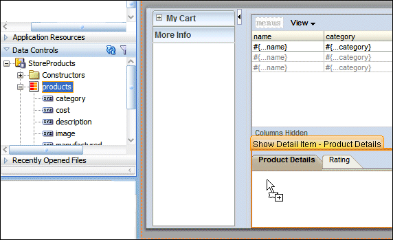
7.
From the Data Controls pane, drag and drop products
onto the Product Details component.
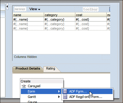
8.
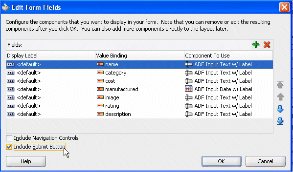
From the menu, select Form --> ADF Form
In the dialog, select the Include Submit Button checkbox.
Click OK.
9.
Your page should now look like this:
10.
Click Save All
icon on the JDeveloper menu bar, or select File | Save All from
the menu.
11.
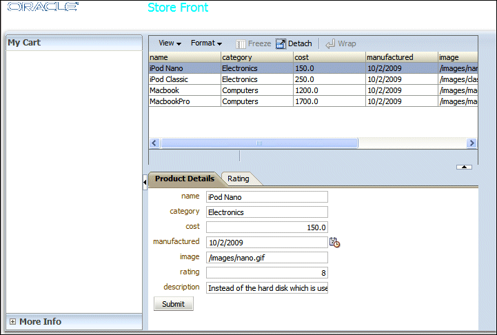
Right click in the page and select Run from context.
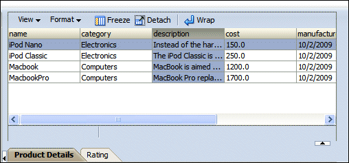
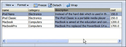
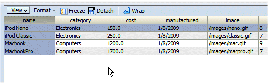
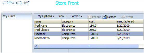
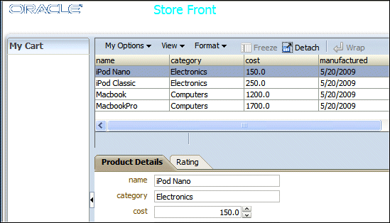
Once loaded in your default web browser, the page displays, showing
the existing products data.
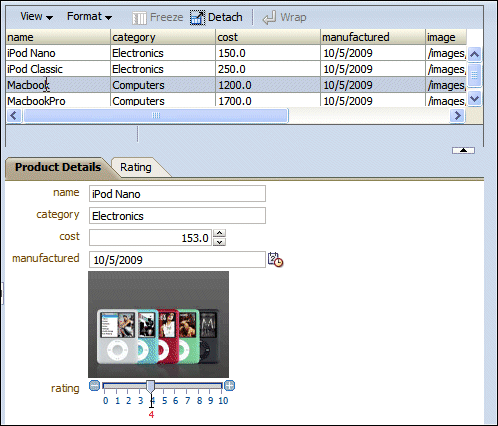
2.
Select one of the column header to move the column to another location.
3.
Experiment column resizing on the Description column.
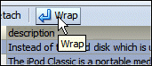
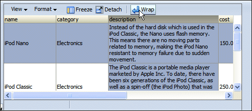
With the Description column selected, click the Wrap
menu option.
Notice that multiple word fields are now displayed on more than one line.
Click the Wrap button again to revert to the previous
layout.
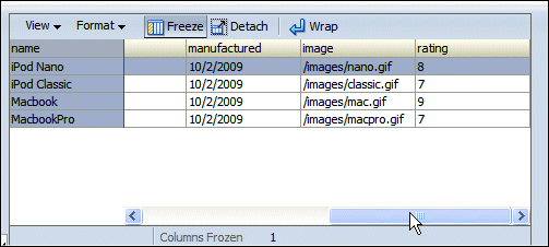
4.
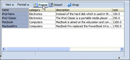
Selecting the name column, click the Freeze
menu option
then use the horizontal scroll bar again to visualize the right most
located columns.
Notice that the name column remains visible.
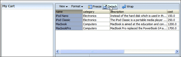
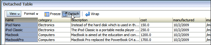
5.
Click the Detach menu option to isolate the content
of the panel in the browser.
Click the Detach button again to go back to the previous
layout.
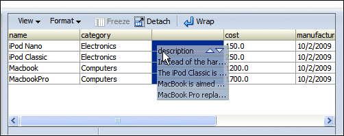
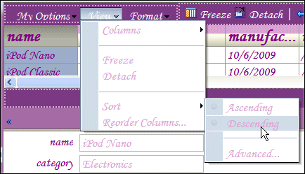
7.
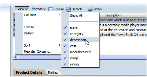
Explore the Menu options for View, allowing you to
hide some of the columns (description for example).
8.
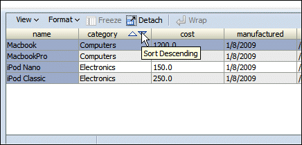
Sort by ascending and descending order on product name
or category by clicking on the column header. The arrows
may only appear when you move your cursor over the column heading.
9.
You can also explore the Menu options for Format,
allowing you to resize columns.
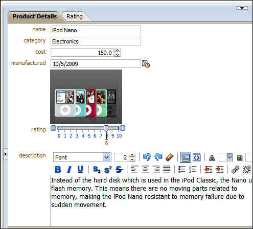
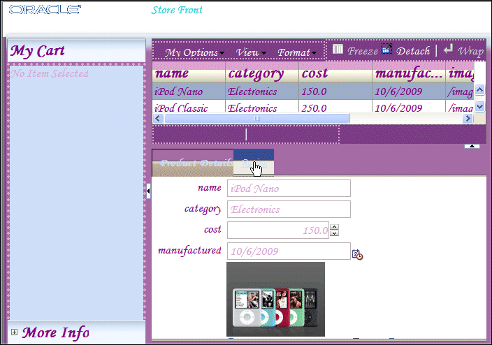
You can display images and graphical representation of your
products in the JSF pages. These images are provided as part of the startup
application. To enhance your JSF page with images, perform the following steps:
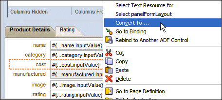
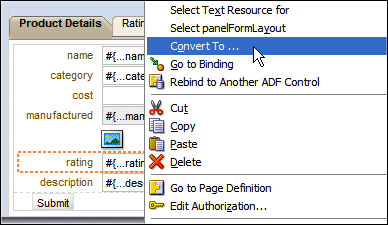
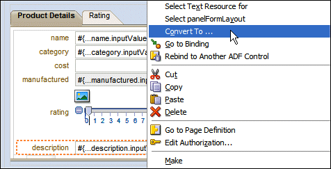
1.
Back to JDeveloper, in the Product Details pane,
right click the cost field and select Convert
To from context.
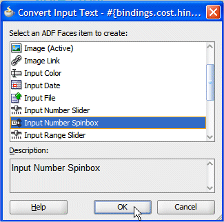
In the Convert dialog, select Input Number Spinbox.
Click OK. Click OK on the Confirm
Convert dialog.
2.
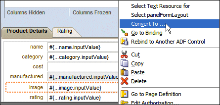
Notice that the image column is set to a text type of value. To be
able to display an image, you need to convert the structure of the column.
In the Product Details pane, right click the image
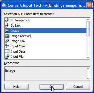
field and select Convert To from context.
In the Convert dialog, select Image.
Click OK. Click OK on the Confirm
Convert dialog.
3.
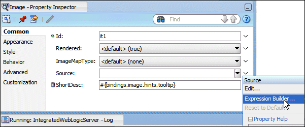
For the new image field created, next to the source
field, select Expression Builder from the drop down
list.
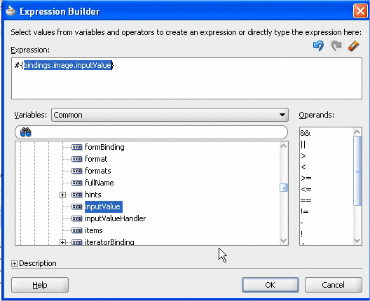
4.
In the Expression Builder dialog, select ADF Bindings | bindings
| image | inputValue.
Click OK.
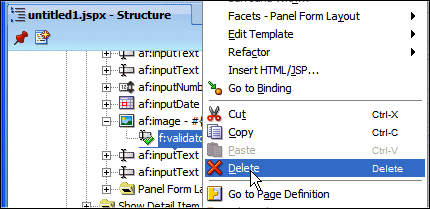
5.
In the Structure pane underneath the image component,
delete the validator component to remove the error
appearing on the design of the page.
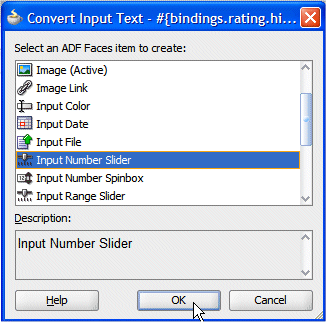
6.
In the Product Details pane, right click the rating
field and select Convert To from context.
In the Convert dialog, select Input Number Slider.
Click OK. Click OK on the Confirm
Convert dialog.
7.
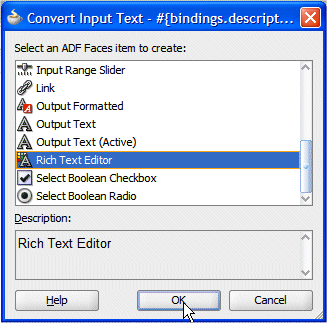
In the Product Details pane, right click the description
field and select Convert To from context.
In the Convert dialog, select Rich Text Editor.
Click OK. Click OK on the Confirm
Convert dialog.
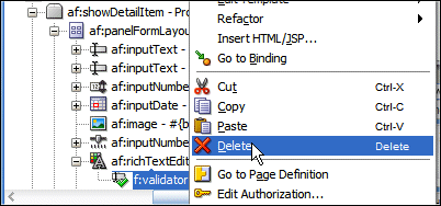
8.
In the Structure pane underneath the richTextEditor
component, delete the validator component to remove
the error appearing on the design of the page.
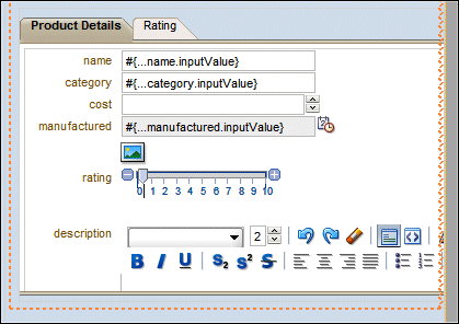
9.
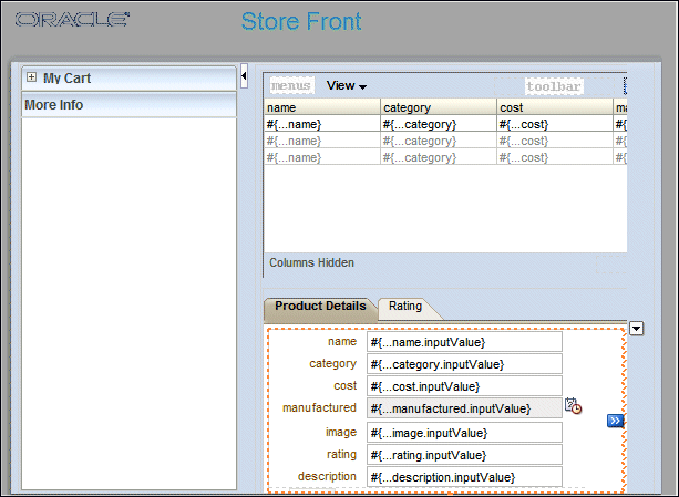
The Product Details pane should look like this:
10.
Click Save All
icon on the JDeveloper menu bar, or select File | Save All from
the menu.
11.
Switch back to the Browser window and reload the
page.
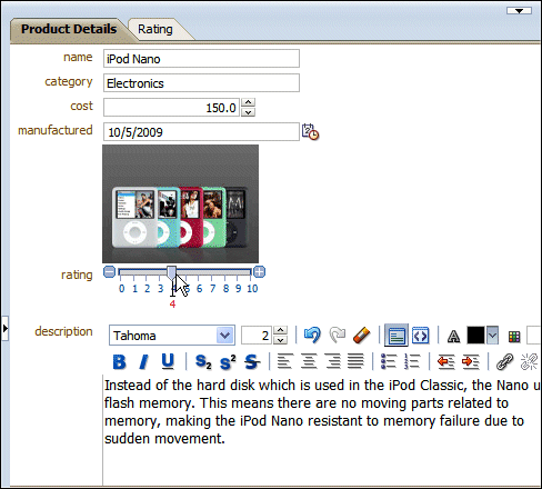
12.
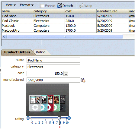
Experiment moving the Rating slider.
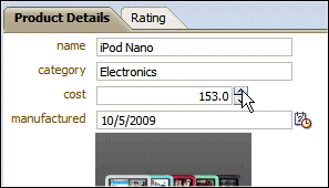
13.
Try changing the cost using the number spinbox.
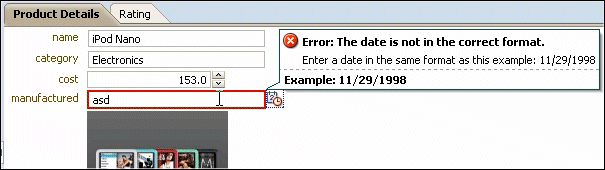
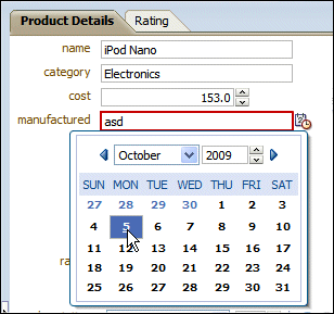
14.
Experiment entering a wrong date value for the manufactured
date field.
Reenter a valid date using the pop up calendar.
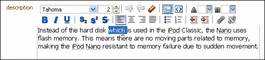
15.
Try the Rich Text editor, select a word in the description
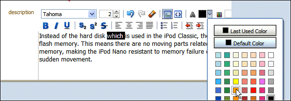
text field.
Click the arrow next to the color box and select a
color from the palette.
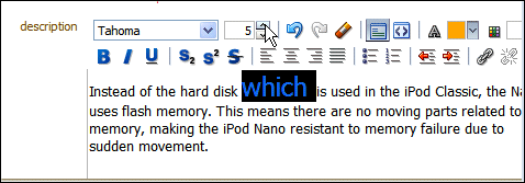
Increase the size of the selected text.
16.
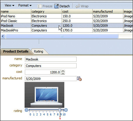
Move on the Product table and double click on any
of the rows.
Notice that the Product Details pane doesn't reflect the change of
product you've made. To implement this synchronization, we need to add
a Partial Page Rendering functionality.
In order to have a refresh of the Product Details when you
select another row in the Product table, we need to set the Partial Rendering
behavior. To implement this function, perform the following steps:
1.
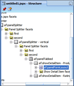
Back to JDeveloper, in the Structure pane, select the panelFormLayout
within the Product Details component.
2.
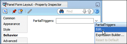
Using the Property Inspector, in the Behavior tab,
using the down arrow next to the Partial Trigger field
and select Edit.
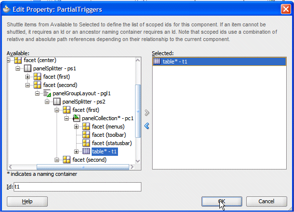
3.
In the Edit Property dialog, expand the panelCollection
component, and using the right arrow button, shuttle table* -
t1 in the Selected pane.
Click OK.
4.
Click Save All
icon on the JDeveloper menu bar, or select File | Save All from
the menu.
5.
Switch back to the browser window and reload the page.
6.
Select another row in the table to change the product details.
You can see that Product Details are now synchronized with the selected
row.
7.
Leave your browser window open and return to JDeveloper.
To implement menu functionality on your page, perform the
following steps:
1.
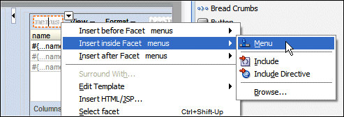
Back into JDeveloper, in the second panel, right-click
within the menu component facet and from context, select
Insert inside Facets menus --> Menu
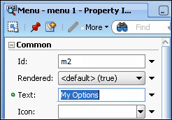
2.
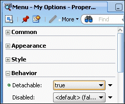
Using the Property Inspector, set the Text fields to My Options.
In the Behavior tab, set the Detachable property to
true.
3.
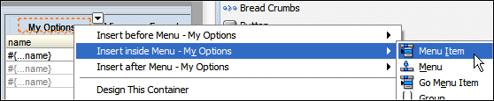
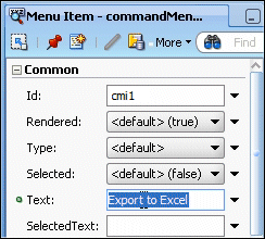
Right click the Menu and select Insert inside
Menu --> Menu Item from context.
In the Property Inspector, type Export to Excel in the
Text field.
4.
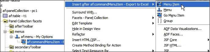
In the Structure Window, right-click the af:commandMenuItem
component and select Insert after af:commandMenuItem - Export
to Excel --> Menu Item from context.
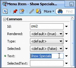
In the Property Inspector, type Show Specials in the
Text field.
5.
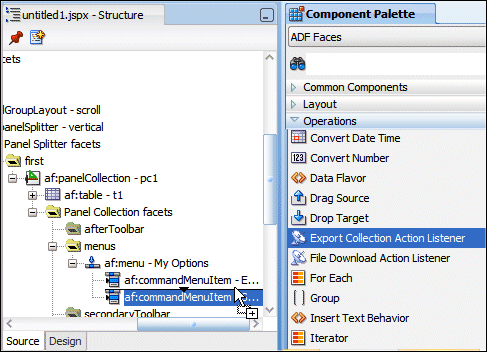
From the Component Palette, from the ADF Faces | Operations
library, select Export Collection Action Listener component and
drop it under the Export to Excel menu item in the Structure
pane.
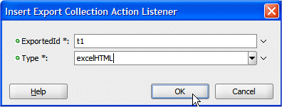
In the Insert Export Collection dialog, type t1 as the
ExportedId and select excelHTML for the Type.
Click OK.
6.
Click Save All
icon on the JDeveloper menu bar, or select File | Save All from the
menu.
7.
Switch back to your browser window and reload the
page.
8.
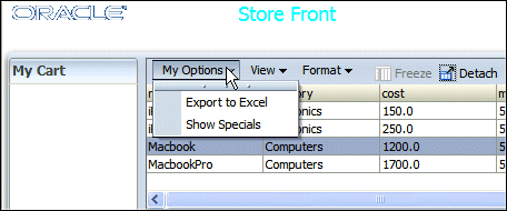
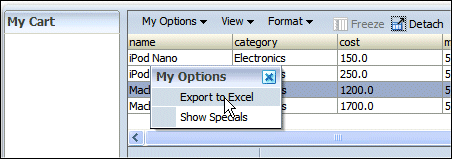
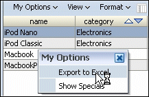
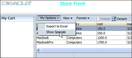
Click My Options menu option.
Notice that you can detach the menu options from the menu bar.
9.
Select the Export to Excel option.
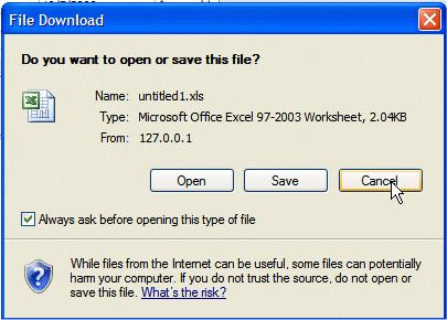
10.
Your browser may prevent you from downloading files, accept to download.
A dialog prompts you for an action to perform with the file, allowing
you to open it with Excel or save it.
Click Cancel. Leave the browser window open and switch
back to JDeveloper.
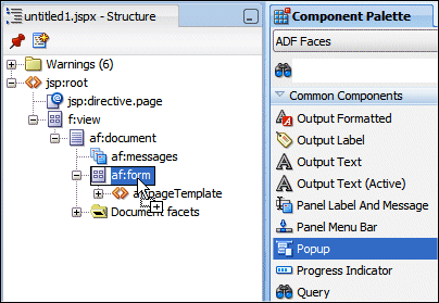
Now you want to create a pop up window that enhance
the properties of a specific product. To create this Pop up functionality, perform
the following steps:
1.
In the Structure pane, select the form
component. In the Component Palette, in the Common Components
library, select the Popup one and drop it onto the
form one.
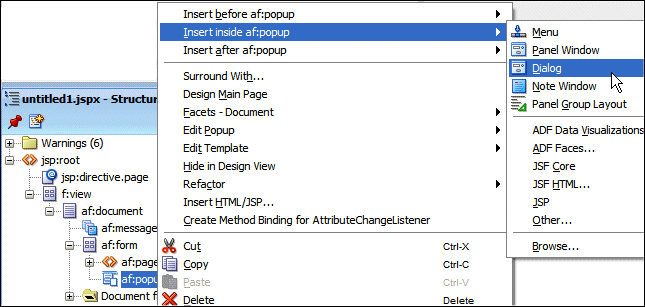
2.
Right click the popup component and select Insert
inside Popup --> Dialog from context.
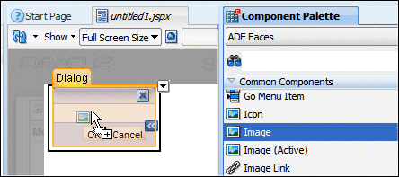
3.
From the Component Palette, select the Image component
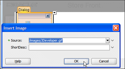
and drop it within the Dialog.
In the Insert Image dialog, from the drop down list, select the JDeveloper.gif
image as the source.
Click OK.
4.
Click outside the image to get rid of the dialog.
5.
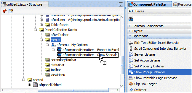
From the Component Palette, from the Operations library, select the
Show Popup Behavior component and drop it onto the
second commandMenuItem.
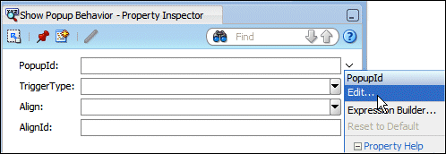
6.
In the Property Inspector, for the PopupId field, select Edit
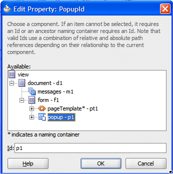
from the drop down list.
In the Edit Property dialog, select the popup component,
and press Enter.
Click OK.
7.
Click Save All
icon on the JDeveloper menu bar, or select File | Save All from
the menu.
8.
Switch back to your browser window and reload the
page.
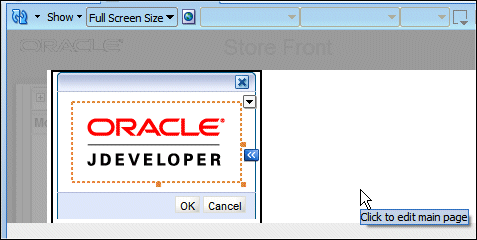
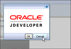
9.
Click My Options menu option, and select Show
Specials.
10.
The Dialog pops up the JDeveloper image.
Click Cancel. Leave the browser window open and switch
back to JDeveloper.
Now we want to create a drag and drop between Product Details
and the shopping cart allowing you to fill the cart from the Product Details
using a simple drag and drop operation. To realize this drag and drop, perform
the following steps:
1.
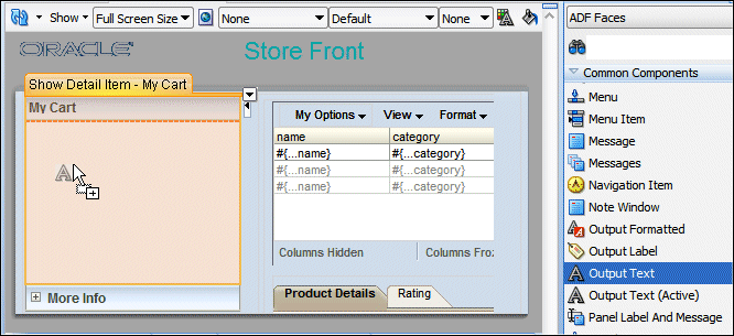
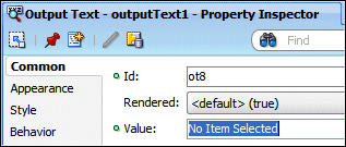
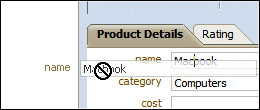
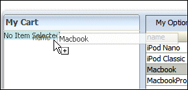
Back in JDeveloper, select the OutputText component
and drop it onto the My Cart pane.
In the Property Inspector type No Item Selected as
the Value for the Output Text.
2.
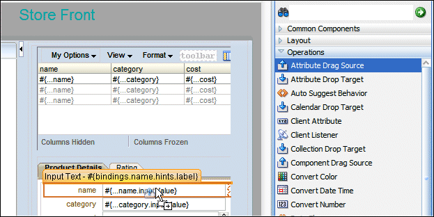
In the Component Palette, from the ADF Faces | Operations
library, select the Attribute Drag Source component and
drop it onto the name field of the Product Details pane.
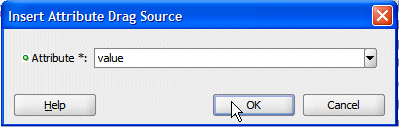
In the Insert Attribute Drag Source dialog, select value
from the drop down list.
Click OK.
3.
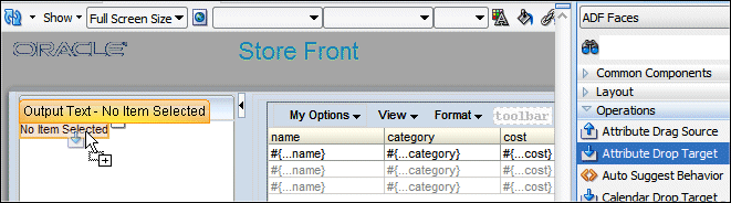
From the Component Palette ADF Faces | Operations,
drag and drop an Attribute Drop Target component onto
the No Item Selected text field.
4.
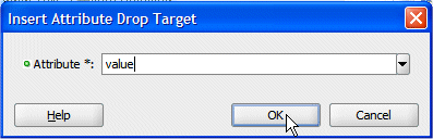
In the Insert Attribute Drop Target dialog, select value
in the Attribute field.
Click OK.
5.
Click Save All
icon on the JDeveloper menu bar, or select File | Save All from
the menu.
6.
Switch back to your browser window and reload the
page, then select an item in the table to display the corresponding Product
Details.
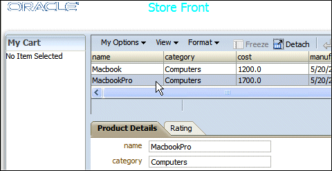
7.
In the Product Details pane, select the name field
and drag and drop it onto My Cart.
8.
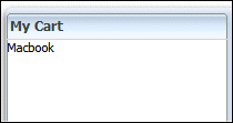
The product is added to the cart.
9.
Don't close your browser window, and switch back to JDeveloper.
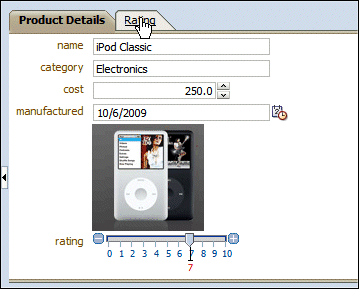
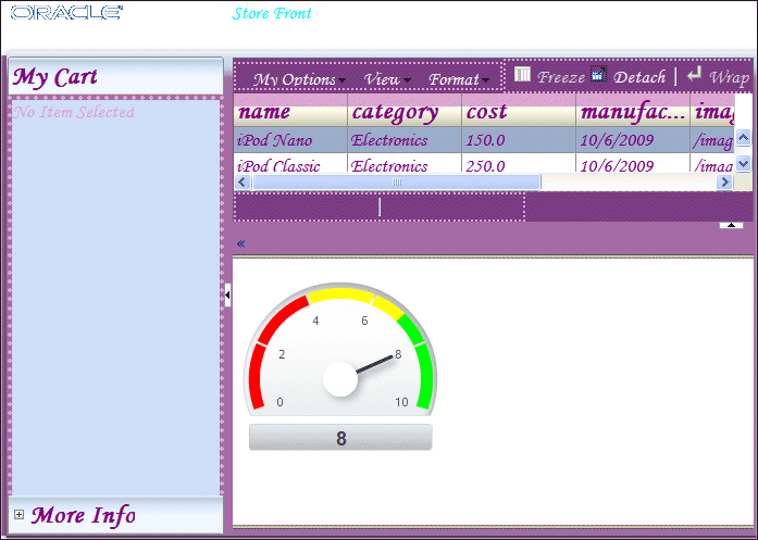
Now you want to create a gauge representation of the rating
value. To create the gauge component, perform the following steps:
1.
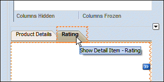
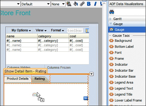
Back into JDeveloper, click the Rating tab.
2.
In the Component Palette, from the ADF Data Visualization
| Gauge library, drag and drop the Gauge component
onto the Rating pane.
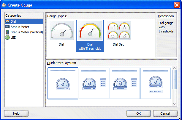
3.
In the Create Gauge dialog, select the Dial category,
then Dial with Thresholds as the gauge type and finally
pick up the left most quick start layout proposal.
Click OK.
4.
The new gauge appears in the rating pane.
5.
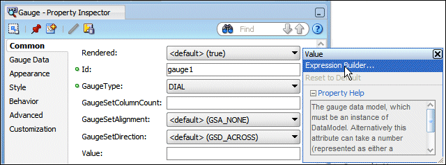
In the Property Inspector, for the Value field,
select Expression Builder from the drop down list.
6.
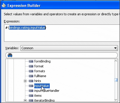
In the Expression Builder dialog, select ADF Bindings | bindings
| rating | inputValue as the Expression.
Click OK.
7.
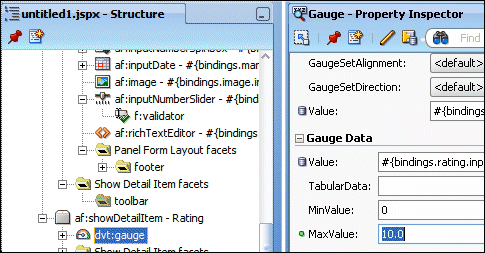
In the Structure pane, select the gauge component
and in the property Inspector, set the Gauge Data | Max Value
field to 10.
Click OK.
8.
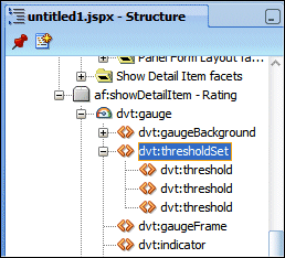
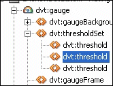
In the Structure pane, expand the gauge | thresholdSet
component.
9.
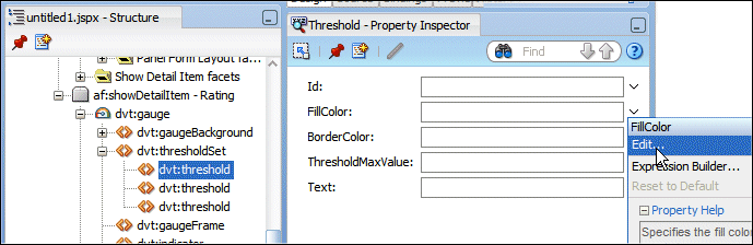
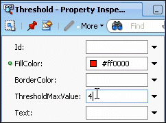
In the Structure pane, select the first threshold and in the Property
Inspector, for the FillColor select Edit
from the drop down list.
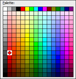
In the Edit Property dialog, select a 'reddish' color from the palette
and click OK.
Enter 4 as the ThresholdMaxValue.
10.
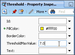
In the Structure pane, select the second threshold and repeat the
last step with a 'yellowish' color for the FillColor
field and a ThresholdMaxValue set to 7.
11.
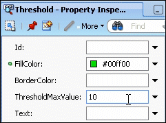
In the Structure pane, select the third threshold and repeat the
last step with a 'greenish' color for the FillColor
field and a ThresholdMaxValue set to 10.
12.
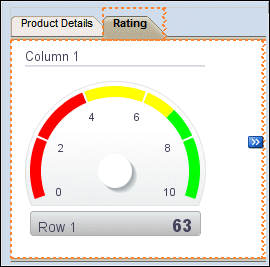
The Rating pane should look like this:
13.
Right click within the page and select Run from
context.
14.
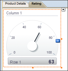
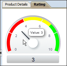
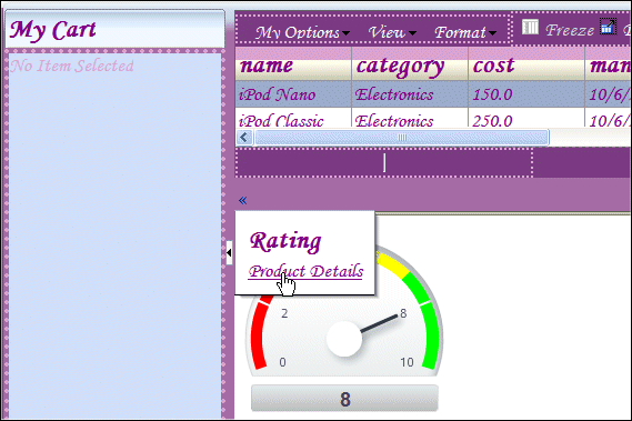
The page loads up in the browser. Notice the rating value.
Then click the Rating tab.
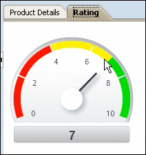
15.
The gauge displays the current rating value.
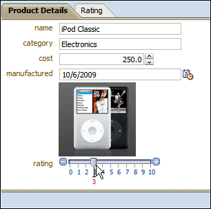
16.
Click the Product Details tab and move the slider
to change the rating value.
17.
Click the Rating tab to see the change reflected
in the gauge.
18.
Don't close the browser window and switch back to JDeveloper.
Using Skins
to change the Look and Feel of the Application
Finally in this section you see how to change the Look and
Feel of the whole application using a parameterized css file. To implement this
functionality, perform the following steps:
1.
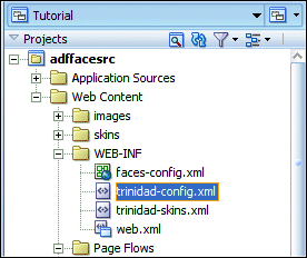
In the Application Navigator, expand the Web Content | WEB-INF
node and double-click the trinidad-config.xml file
to open the file in the editor.
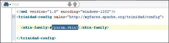
2.
The file contains a parameter enabling you to use a different css
file.
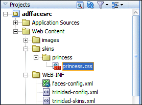
3.
In the Application Navigation, notice that there is a princess.css
file in the skins | princess folder.
4.
In the browser window, remove the last part of the URL (after the
untitled1.jspx page name).
5.
Append the following string ?skin=princess at the
end of the URL and press Enter.
6.
Notice the changes in the look and feel of the pages.
7.
Colors, Tabs and Accordions are now using the princess css.
Experiment the new look of the page.
Close your browser window. You have now successfully performed this
OBE.

 Bookmark
 and type
center as the Name.
and type
center as the Name. 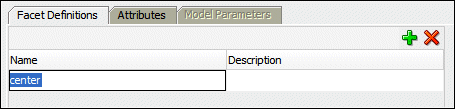
 icon on the JDeveloper menu bar, or select File | Save All from
the menu to save the diagram.
icon on the JDeveloper menu bar, or select File | Save All from
the menu to save the diagram.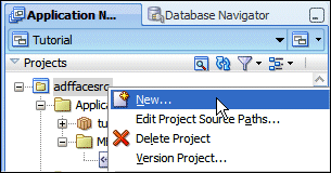

